BRANDING
Feelouve
Art Direction
Branding
Packaging
Social Media
01 > 04. 2022
Tea & infusion,
Wellness, health
Brand creation
How to embody the purpose focused on the women’s well-being?
Challenge
The Feelouve brand was born from the desire to support women in every difficult stage of their lives (skin condition, weight increase, menstrual pain, breastfeeding, menopause,…). Give life to this mission through a fresh and feminine brand territory.
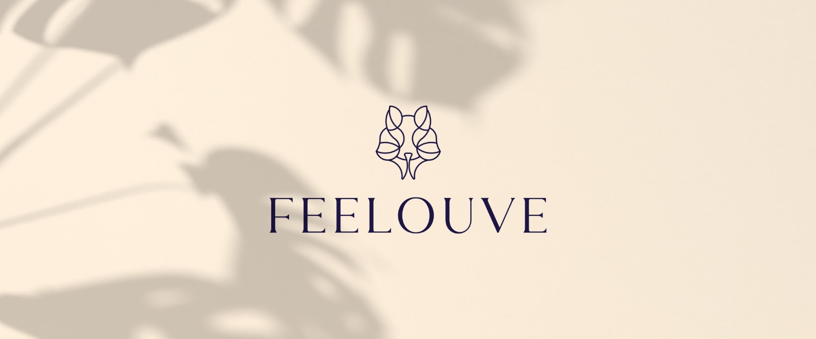
Rich in interpretation, the symbol evokes the figure of the she-wolf, the curves of the tea leaves in a spirit of harmony thanks to the symmetry of the forms. The typography is elegant, feminine and distinctive.
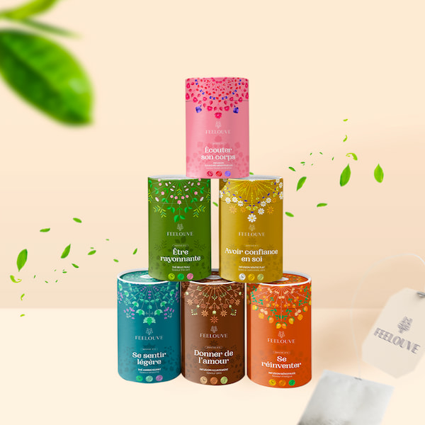
A color palette that fluctuates between human warmth and spiritual depth, with light tones dominating.
A typographic system with a round and greedy style.
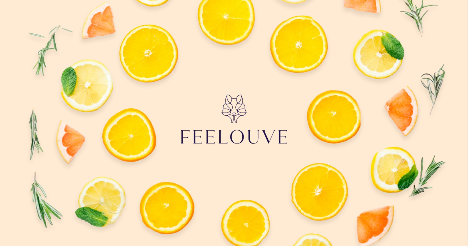
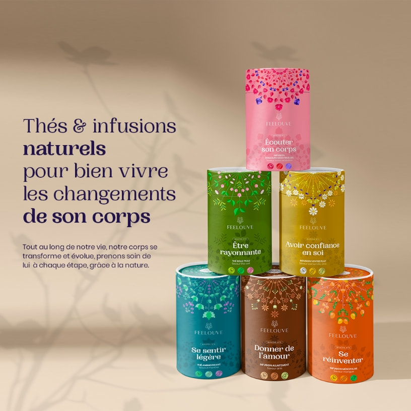
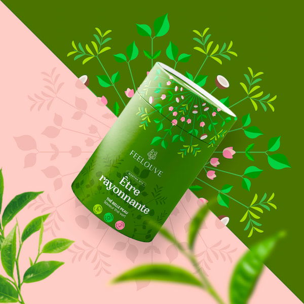
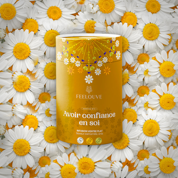
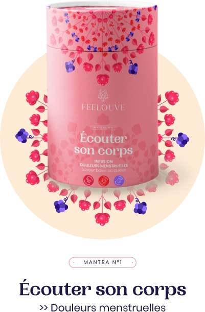
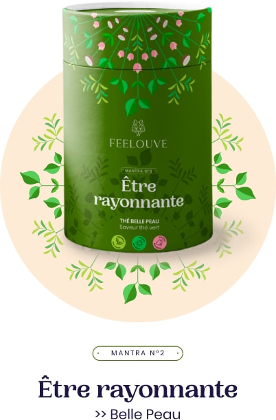
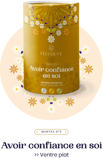
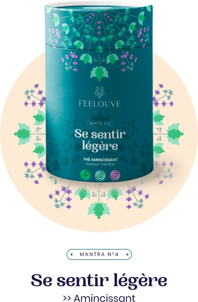
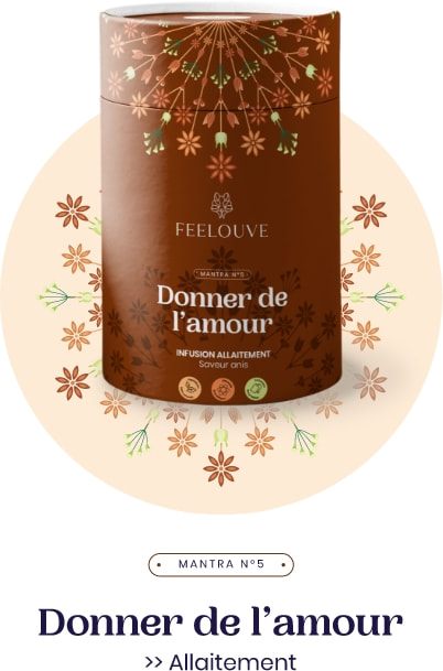
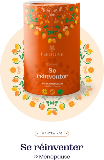
Always in the spirit of balance and harmony of geometric shapes, the packaging is built around mandalas based on plants and fruits. Each range is composed of a plant mandala with its own identity.
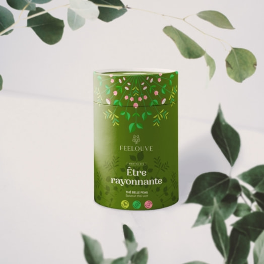
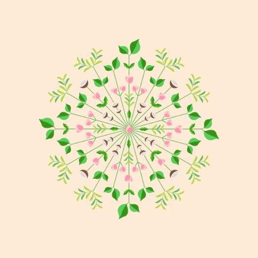
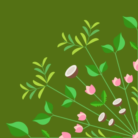
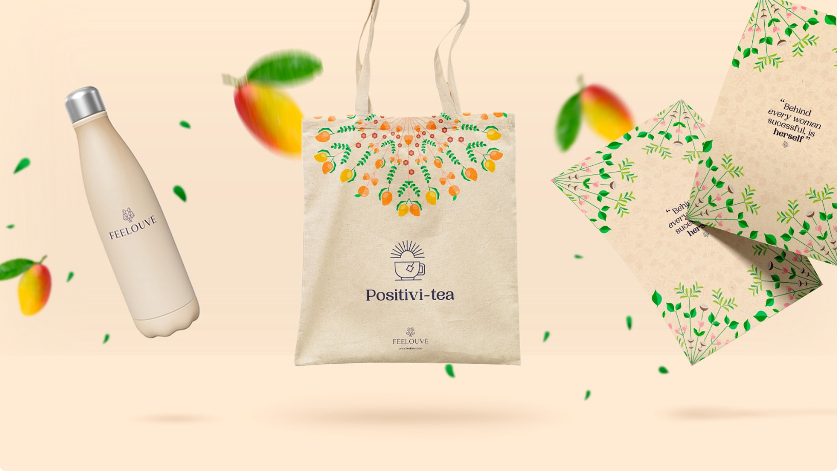
An editorial line to launch the brand around 3 themes:
- Presentation of a product, the need it fulfills.
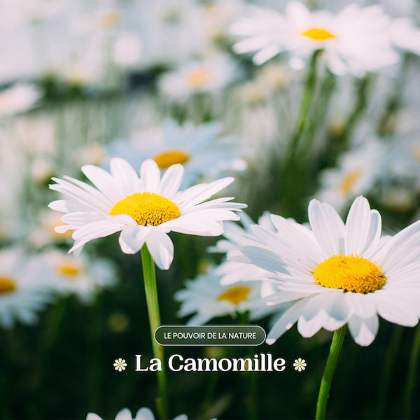
- Focus on a natural ingredient and its virtues.
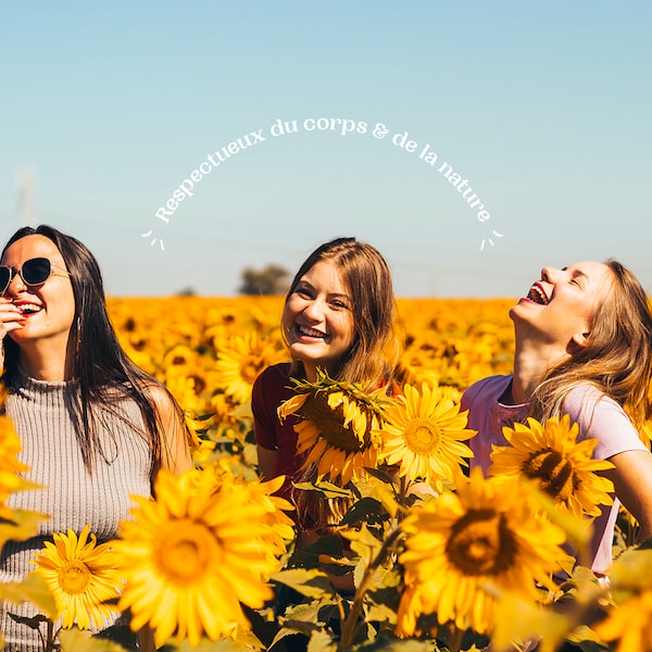
- Feelouve’s commitments and values.

